Monday, November 13, 2017

Week 11 - More Last Minute Madness


This was a last minute, 3am, figure drawing that went from focusing on gesture to look at light source and colour values.
I wanted to use simplified brushstrokes for the maid body with the focal point being her face and mask.
I also wanted to convey a sort of sorceress, power vibe and or mood. The hands were a bit off because I didn't make use of a reference.
Still, I like the texture on the skull/mask and I enjoyed trying to think about how the light source would affect the plains and shapes of her back, while trying to keep that liquid gesture to her body. (Trying to keep my figures from looking stiff).


Week 10 - Last Minute Line and Scene Study


I got a little side tracked. Okay very side tracked and went overboard with the background story and motivation for my Witcher Concept Character.

I should have saved the energy and time for some of my other work but I found that I was able to keep my anxiety at bay for some time when fleshing this character out and discover how to utilize the already well established Witcher lore.

I drew this in part to use for a small side project I created to showcase my ability to direct and collaborate on a project (as well as tell the characters backstory in a much more interesting way, through audio and visuals).

I thought of the scene, the twisting and twirling shape language of the line and how to use a simple background with receding values.
I think it came out pretty well.


Week 9 - Buffy Colour to Black and White Study


Who'da thought that by studying something, I'm learning techniques which I can then apply to original, plucked from my brain work. I decided to focus on my values and how the light is affecting the plains of the face from being back lit. It's also interesting to note the intensity and range of the light.

Light source... light source... light source.

Shape x (light source) + value = form.


Monday, September 11, 2017

Create 101 - Semester 2 - Week 6 - Mini Male Portrait/Value Studies


One layer - mini portrait studies, from reference.

After drawing the Jesus looking fellow I moved on to Sven from Switzerland (well I'm guessing that's where he's from).
Then I went to beardless town and found a photo that is fantastic for studying values. Just look at the lighting? It's pretty coolies.

I didn't zoom in very much for these - used only two brushes and had a pretty low stress, fun time doing them. I need to do more.


Create 101 - Semester 2 - Week 5 - Caprian Jackal


Trying to get the flintlock fantasy world of Capria out of my head and onto the page. 
As my skills improve, I hope my ideas will read better.

STORY
The following is a regimented unit known as a a "Jackal." They are a secret police force who serve the Black Fox - the Empire's Seeker of Truth (Imperial Inquisitor).

They were originally called Hounds, but due to being easily confused with the nation of Hundar (an opposing nation refereed to as "Hundar Hounds" I changed it to Jackal.

Jackal is a better fit as it can be defined as - "a person who performs dishonest or base deeds as the follower or accomplice of another"

The idea is, you can do terrible but necessary things as a Jackal. Caprians don't believe in capital punishment (more on that for another time) - but as a Jackal, one has the anonymity to carry out Divine Justice.

Essentially any Caprian woman can be a Jackal. There are "forever" Jackals and those who are summoned in secret to serve The Black Fox.

Each has a number. Each is is known only to the Black Fox who, as gifted by Yemere, has the ability to recognize the woman under the mask. All are also recorded in the Black Ledger.

This keeps undesirables from entering the ranks. The Aimless have tried and failed many times to don the black mask and assassinate the Empress.


PROCESS AND DEVELOPMENT


I wanted to give the Jackal a heavy coat and hood (to cover the hair). Problem with the hood is - do I have the ears sticking out through the top? Hood holes? It could, sort of work. I'll have to look into more designs.

I am happy with the "Anubis" looking mask. I also wanted red lenses in the mask to give them a more ominous look.

I'm still not sure how far I should render something like this. I really have to learn more about concept work and what each stage is actually called. I understand thumbnails, however, I see some with just black and white, others with flats.

Not sure if my anxiety is making me over think these things.

Either way, I will continue to think about my shapes, my form and how to best render them in my work.


Create 101 - Semester 2 - Week 4 - Portrait/Value Study


This week I decided to go back to my comfort zone for a moment. 
I utilized a reference photo and focused on my values. The proportions are a little off and I am still discovering different brushes.
I went back to this portrait and made the nose less crooked. I also tried using the brush at a higher opacity, looking at the form and not being afraid to do more defined strokes.


Wednesday, September 6, 2017

Create 101 - Semester 2 - Week 3 - Cyberpunk Bounty Hunter


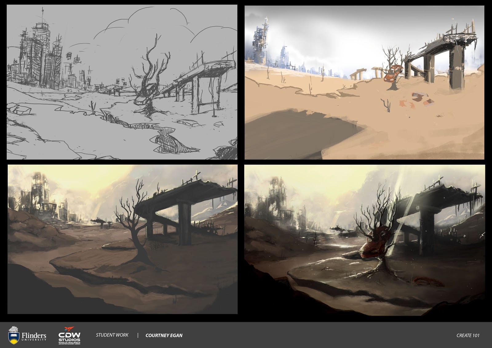
Have been doing 2-3min gesture drawings using a figure drawing, reference website. Have discussed with work as to whether I can have Friday nights off so I can make it to actual, live, figure drawing at CDW as I think this will help me immensely.


For this week I decided to draw a cyberpunk, bounty hunter. When I was younger, some of the first anime I ever watched were from the small collection of Manga VHS tapes at my local Video Ezy.
This included a lot of cyberpunk - Megazone23, Bubblegum Crisis, Project A-Ko, Ghost In The Shell, a whole bunch of others whose names escape me (must be getting old). 
I also thought of Blade Runner. 

I was originally going to include a street scene. Given my current skills, I decided to focus on just a character design.


Unfortunately, I don't think I captured the look or feel that I was going for originally. I was very caught up in trying to make sure the gesture of the body was right.


I wanted a yellow, spray like jacket, a gun with neon lights. I eventually came up with two versions. One with a more techno, 90's vibe. Then I gave her a prosthetic leg and tattoos. I struggled with the hand over her gun holster, as I really wanted to make sure you could actually see the hands (and not some lazy, fudged attempt).


I was happy with my line work. I can see an improvement. I also tried colouring using flats and an overlay layer, as I saw Tyler doing during the Art Show. My final design is below. 


I also, finally realised what underlying, mental barriers I was experiencing during the development of this character. Now Tim, this is going to be a bit of a rant, so if you don't have the time or interest in reading further, it's completely fine. 
I just figured I would type it out on here, as I think it is important to my creative process and is something I need to address if I want to continue with character design. 

As you may have figured already, from some of my work, I am passionate about exploring and challenging socially, conditioned ideals of gender and gender roles. 

While working on this piece, I came to terms with some of the experiences I have had, when wanting to discuss the portrayal of women and female characters - specifically in genre's like gaming and comics. 

I finally figured out what has been bugging me so damn much and why this is so important to me. I believe you only have this life and it's about time I stopped doubting how I feel about this. So here it goes. 

Female representation in gaming/comics - the difference between sexual and sexualised.

When it comes to discussing female characters in games/comics and the topic of sexualisation, I'm often met with comments like - 
"It's not real, it's a fantasy", "Women are aesthetically more pleasing than men", "Sex sells, deal with it" or "most gamers are straight men, that's who they need to market to - that's where the money is."

When I went to draw this cyberpunk character, I was willing to just accept that I should probably make her look sexy. Big tits, slim waist, nice legs - follow the archetype. As I sketched her out, I felt like a hypocrite. "I thought you didn't like the sexualisation of women in gaming?"
No, that's not the problem. Shit, what was my problem exactly? Then it hit me. 

The problem is the "role" female characters have - their purpose, their function. 
Their reason for being and how it is portrayed. 

The idea that women "can't" be anything but sexy or desirable. They are a quest, the end game, a love interest. If not that, then they are a family member - a daughter to be saved or a sister like character that has known the protagonist all their life. 

Image result for booker and elizabeth

If not for your enjoyment, then they are a villain, evil or insane. If they are strong they are usually cold, distant.
Then there is the token - the one and only female member on the team. - sexy, or if not for your viewing pleasure, then they must be boyish, just like one of the guys. 

It's right about now that I hear it. The thundering cries of "but men are all ripped and muscled in games, they get objectified too".

I ask wearily, objectified how, and for who? 


They can be suave, strong and sexy. Everything a social ideal tells us a man should be. That's an idealised version, a fantasy, but of a different kind. (and is not exactly the best representation of dudes all the time either, but that's another rant).

There lies the difference between "sexy" and "sexualised."


It would appear that male characters are usually designed to suit their purpose/archetype.

You will have a swordsman who is muscled, but unlike a female swordsman they are usually fully clothed and not missing armour to show off their massive package or their well toned calves. 

Male characters don't need to be sexualised to fulfill their characters purpose, whereas many female characters have only one purpose, and that is to be sexy.

So am I proposing that should games be full of nuns? Am I pushing for titles like Grand Barn Amish IV? How dare I try and take away the boobs and butts and the ability to bash hookers. Seriously. 

This too seems to happen whenever I bring this stuff up. Why does it have to be one extreme or another? Shit son. I just figured after loving games so much, for so many years, it would be kind of cool to have "my" fantasies get some representation.

Like the fantasy of seeing a woman being sexual on her own terms, for her own purposes. A woman with her own interests and backstory that doesn't revolve around a man or her looks - A unique story and not one transplanted from an already well-established male narrative.

I also want young boys to be exposed to seeing female characters that aren't just quest items or something you find at the bottom of a castle. To see women as friends, allies, mentors, rivals and formidable foes. Also not just as a character carrying on some male characters story. As protagonists in their own right.

As for young girls - representation matters. 

I was lucky enough to be exposed to characters like Princess Nausicca - (knowing her under a different name as it was released in the 80's - "Warriors of the Wind") Either way. She had her own goals, her weaknesses, her strengths. Nausicca was never purely sexualised or idolised. 


(Yeah I know this is anime and not a game, nor a comic. This is still an awesome example in my mind of how you can write, portray women in any genre - film/gaming/fiction etc.)

Recent games/comics  are doing a lot better. There are exceptions.
Bioware is leagues ahead in some ways with the representation of diverse characters (at least they're trying).

When I went to draw this cyberpunk character, I hesitated. 
A part of me wanted to make her beautiful, sexy, alluring. To follow the archetype. Then I realised I could work through this. I could learn to draw women being sexy, but not just for the straight, male gaze. I would think of the curves, the beauty, the skin, the hair, the mind, the love, the fire, the passion, the life behind the form. Women can and are sexual beings. I don't want to erase that.
Instead, I want to reclaim it. I'll take it back from this idealistic "fantasy" that women can only reflect a small number of specific roles.
And when someone tells me "it's fantasy" I'll happily proclaim that yes, yes it is, but it's not the only fantasy. 

Fantasy is, after all, about asking "what if?"


Monday, August 7, 2017

Create 101 Semester 2 - Week 2 - Post Apocalyptic Desert

For this week in Create 101, I had an idea about a post-apologetically landscape that included a shot of a tree, growing up and through a car.

In hindsight, I could have just focused on the car and the tree - creating a small concept design for the object. As I had just started Digital Painting with Simon, I was more aware of gathering reference shots, however, I hadn't learned the magic behind custom shapes and how to utilize them in composition thumbnails.

I also didn't have the knowledge or experience of compiling thumbnails for environment scenes, which would have made my process a lot easier and hence helped me create a more dynamic and solid image.

Not all is lost in this piece. I am happy that I followed through on process steps - construction lines, using my sketchbook to work out possible composition. I was able to think about values, however, there is much work needed on my perspective and formation of foreground - background, with overlaps.

I do have some overlaps. I wasn't too happy with my colour palette. The mood is okay, I do like what I have done with the skyline. I do believe I needed a bit more detail and form in the foreground as it looks a bit too flat - also the value grades are too dark.

Overall - I think I have learned a lot from attempting this piece.


Tuesday, August 1, 2017

Create 101 - Semester 2 - Week 1- Capricorn Zodiac Warrior


Back to it. Whoo! Much drawing. Such art.

Was trying to design a Capricorn Zodiac Warrior. Capricorn is represented as a goat... fish... thing.

So at first I went in trying to make a mermaid with a goat horn helm.

I was pretty happy with the rock, but then I realized she looked a bit bored? Also the rock is sort of just floating in space. Very pretty - not quite what I was going for.


Then I tried an eco-warrior angle. I thought about what she would be fighting for and I considered adding our plastic waste problem in the oceans to my theme.


I was really happy with the gesture and felt that I got some good perspective on the tail. Then you Tim! YES YOU TIM! :P Offered some awesome and interesting feedback during the art show, letting me know that the narrative wasn't as clear as I had hoped. That I also needed to consider the hair more (to make it appear more underwater). So I went and had a look at some references and reconsidered my theme. Was happy with Simon's feedback concerning my gesture and line.


My final image has a more celestial, ancient warrior approach in theme. I wrapped the tail around like you suggested - I then also considered making the tail more interesting by adding details that remind me of a fight fishes tail (like the ones at work). :P 
I lifted the hair up and back and drew some shapes and twists to make it appear like it was floating and had individual pieces to create overlaps and depth.

I added the pink and gold in the colouring so there could be some warmer colours somewhere in the palette. I hope the horns are big and bright enough on the helm. I wanted to give them a pearl like shine or quality. (Not just golden).

I feel that I am making improvements with my line work, shading and highlights.


Sunday, May 21, 2017

WEEK 9 HOMEWORK - CREATE 101


A quick environment painting. May need more lighting on the trees and path from light shining through the leaves. 

Darker tones of green for leaves that are closer i.e the branches and trees in the foreground.

Happy that I'm trying different things and thinking more about my composition.

Maybe a bit too saturated? Or not enough of a warmer tone in there somewhere?


WEEK 8 HOMEWORK - CREATE 101


This particular piece is a simple character sketch of two of my original characters.

Was thinking about gesture and line. Need to work on my base lines to help build up my shapes and form. I notice that instead of starting a new layer, I end up editing the base line sketch.

Practicing, clean, precise line. Gesture feels a bit stiff. Needed to define action line.

Hoping I will be more confident with my colouring as I practice colour theory more.


Thursday, May 11, 2017

WEEK 7 HOMEWORK - DRAWING

Going to orgainise this blog a little bit better. Hopefully this will make it easier for you to see my homework Tim McBurnie - Hi Tim!


Had to play catch up on my homework but have finished an image for Week 7 of Create 101.

So the original concept was the idea of a Caprian solider kissing her husband goodbye before heading off to the front line.


Decided it would be a snow setting. This is drawn from a region of Capria I have created called Felharn. It is a northern province of the Empire and is known for it's iron, blacksmiths and is the only region of Capria where it snows. Felharnian's tend to be very robust and make up the majority of the Caprian army.

Checked snow references to put together a palette. Lots of blues through to grey and bright white.

First image looked too stark and thought about the visual hierarchy feedback I received from Tim.
Added a morning light/pale sunrise.

Moved into warmer tones to draw attention to the figures. I think I could have had more red on the figures. I am happy with the splash of red on the axe handle - drawing from the browns in the wood tones.

Need to work on perspective - i.e. the house. I think I could have had more line and composition work in the early stages of my process - so I could end up with a more balanced scene.

Not sure if I should have had an orange tone in the yellow, almost green yellow hues I have for the sunrise.

Happy with the snow textures. Need to work on values.


Sunday, April 30, 2017

Another Portrait - Mood and Colour

UPDATE:

After some feedback from Tim McBurnie
I will be thinking more about visual hierarchy and not worrying about losing detail detail.

Ensure that you can recognize forms. What's the story behind the imagery (what do you like about what you are drawing).

Where do you want to draw the viewers eye/attention?

_____________________________________________________________________

Drew this just in time to submit for my Create 101 Assignment 3.

Feel like I'm treading water. Only just managing to keep up with my Uni work.

This is a possibly concept/character portrait for one of my original characters - Capello Detores.

Again I am drawing from my novels characters and world for my inspiration.

Lost form with the hair and I don't think the lighting works as well as I hoped it would.

Her lips are a little too Angelina Jolie for the look I was going for. Will need to do some more face studies.


Saturday, April 29, 2017

Portrait and Colour Practice (Week 5 Create 101 Homework)


Homework for Create 101. Decided to try doing a colour portrait of my awesome friend Vi.

I made her eyes a little too big. Lost some detail and form around her hair and ear.

Was fun to play around with warm - cool colours.

I was late publishing this on my blog. :/


Still Life, Silhouettes and Spaceships

In Digital Principles I found myself learning to draw spaceships.

Now don't get me wrong. I like spaceships. Not as much as Lego Spaceman but still, I do enjoy a nice, slick, space ship design or two.

Let's just say drawing spaceships had me wondering struggletown for over a week.
I could just not get my head around the perspective, the shading (as simple as it was meant to be, I mean, come on Court! It's a silhouette!).

The shapes confuzzled me and the forms became an elusive beast I was constantly chasing with my wacom pen.

I should have been a bit kinder to myself. I've never drawn a plane before, let alone a spaceship.

I eventually got the homework done and hopefully, it was enough to pass my third assignment for Art Bootcamp.


Also, managed some still life practice.


Now to catch up on more still life practice. This time. With colour! 

Till next time. :)


Sunday, April 2, 2017

Composition Whoo!


Have been learning the wonderful world of composition - creating depth and working with value in Digital Principles with Ned.

This has been a brilliant for me and I feel that I'm really starting to "get" how to compose more dynamic and interesting work. It helps me think about not just the overall form of an object, but where it is in relation to the scene.

Then we get into value, light and dark, foreground, middle ground and background.

Going back to basics and learning that I really need to "know" what I'm drawing in terms of line, gesture, perspective and value to create form.

There is also importance of the story behind an image. I can't just chuck random things together (well I guess I technically could but... they wouldn't really tell us much).

Here are some examples of composition thumbnails with depth and overlaps.


All this depth and composition business inspired me to me to draw the following environment scene for Digital Fundamentals with Tim.


Not quite sure about the tree. Seem to have lost a bit of depth and definition in the mid-trunk section.

Have discovered some cool brushes for grass and leaves.

I don't know if you noticed, but I really dig drawing distant mountains and clouded skies.

P.S. I should have drawn Link standing there somewhere - feels very Breath of The Wild.


Till next time!


Monday, March 27, 2017

Perspective and a Caprian Deity Named Capro.

I'm a bit behind with my Art Bootcamp work. Drawing buildings and trying to get my head around perspective proved a little stressful. However, I persevered and managed to draw... something.


Sure looks like a house. I will definitely be doing some more practice for drawing buildings in 2 point perspective. I'm not ready for 3 point just yet.

In other news, I finished this drawing for my Digital Fundamentals class. (Create 101).

I decided to do some character design for the Caprian deity Capro - First Daughter of Yemere.


Yemere is their divine creator. According to the Caprian Creed, the world came from Yemere's womb.

Yemere is essentially the universe, or force all spirits and life wish to return. She created four daughters who embody different facets of herself, so that she might go out into the world and experience her creation for herself.

The Empress of Capria is said to be a direct descendant of Capro, from when she walked the world with her sisters and founded the Caprian Empire. Capro is the embodiment of Yemere's strength and courage and it is through her guidance that all Foxes (soldiers) serve in battle.

I decided to try a different pose and angle - may need to work on her armour and attire a bit more.
I think the hair looks pretty good. Was originally going to turn the hair into flames.

As Caprians have no stigma associated with women being topless, Capro is often depicted this way.
(Caprian men on the other hand must always keep their rosy buds covered) :P

It's been awesome to draw from my novel and the world I have been creating for over two years.
I look forward to finishing my draft this year.

Till next time.


Wednesday, March 15, 2017

Mannequin Drawings (Line and Gesture) and Some New Art for Digital Fundementals


So I've had a crack at mannequin drawing for Digital Principals (Art Bootcamp).

I found it very tricky to keep track of my line of action (or movement) of the body as opposed to the general form.

I still need to figure out how to make clear, single stroke lines so my drawings don't appear so sketchy.


The one very cool thing about learning how to draw figures is that I can draw some more characters and concept ideas from my novel.

Which brings me to my weekly art piece for Digital Fundamentals.


Did some colouring, drew some puffy, trunk hose on a pretty young man. So I'm pretty happy with my efforts.

Till next time! :)


Saturday, March 11, 2017

Elliptical Forms and Trees... So many trees.

After playing around with my Wacom Cintiq settings (and re-formatting my laptop) I think I may have finally sorted out my wobbly line problem.

That or my hand is getting steadier. 

Either way, the pen, pressure sensitivity appears to be working properly and I can make cleaner lines.

Which is good thing, because my homework from Ned in Art Bootcamp involves drawing trees, elliptical forms and a series of human mannequins. 

So far I have managed the 30 or so elliptical forms and 30 something trees.


I have grasped the basic idea of using ellipses and cylinders to create form, but I will definitely need to work on my perspective,

On a side note - my husband Richard is currently playing The Legend of Zelda - Breath Of The Wild.

Having only ever played Sega and Playstation games as a kid, I don't get the same nostalgia kick Richard is currently experiencing; however, it does look like a very decent game. 
I will have to wrangle the WII U from him at some point to play it for myself.

While watching Link fighting his way around Hyrule, my eyes couldn't stop noticing the trees and my mind was quick to start breaking them down into basic shapes. I see you trees! In all your cylindrical ellipsicalness! How you bend, this way and that. It's pretty nifty and I'm glad that I have learnt how to do this. 

As for the final part of this homework - I hope to have a few human mannequins drawn soon. 

I hope to apply the techniques and skills I have learnt in the past week about line, form and gesture to the art piece I need to draw for Digital Fundamentals homework.

Till next time!


Monday, March 6, 2017

Car Studies and The 8 Minute Challenge

For my Digital Principles homework with Ned, we learnt how to break down a car into basic line and shape in order to create form.

I have found that it has really helped me understand the steps involved in drawing, well, anything really. I have the habit of skipping stages i.e. jumping from my basic outlines and onto line work and shading.

Today with Tim in Digital Fundamentals he talked a bit about this, as well as about how doing technical drills can help you become more intuitive and eventually get to the part where you know "exactly" what you are drawing. There is difference between knowing the "symbol" or idea of something than actually knowing it's entire form, broken down into individual parts.


This brings me to the second homework exercise for Digital Principles - The 8 minute drawing challenge. Essentially you decide to draw a subject (could be anything) for a duration of 8 minutes, but at different intervals. This is meant to help you relax and get into a drawing "flow". It can also help you get faster at drawing particular images. 


You can find more info on The 8 Minute Challenge here. The page also has a link to a timer on Youtube.

Tim also gave me some handy tips on what I can do about my wobbly line work. 
Going to adjust the way I sit with my tablet (I seem to like lounging on the couch with it sitting on my lap) so I can hopefully get a smoother, more precise line.

Could also be that I need to practice drawing circles and crosses some more. Yes you read correctly. Circles and crosses; and lots of them! Like this -


Drawing these doodads over and over also trains me to not to put so much pressure on my wrist. It's all in the shoulder! Er... elbow.

Till next time!