Monday, August 7, 2017

Create 101 Semester 2 - Week 2 - Post Apocalyptic Desert

For this week in Create 101, I had an idea about a post-apologetically landscape that included a shot of a tree, growing up and through a car.

In hindsight, I could have just focused on the car and the tree - creating a small concept design for the object. As I had just started Digital Painting with Simon, I was more aware of gathering reference shots, however, I hadn't learned the magic behind custom shapes and how to utilize them in composition thumbnails.

I also didn't have the knowledge or experience of compiling thumbnails for environment scenes, which would have made my process a lot easier and hence helped me create a more dynamic and solid image.

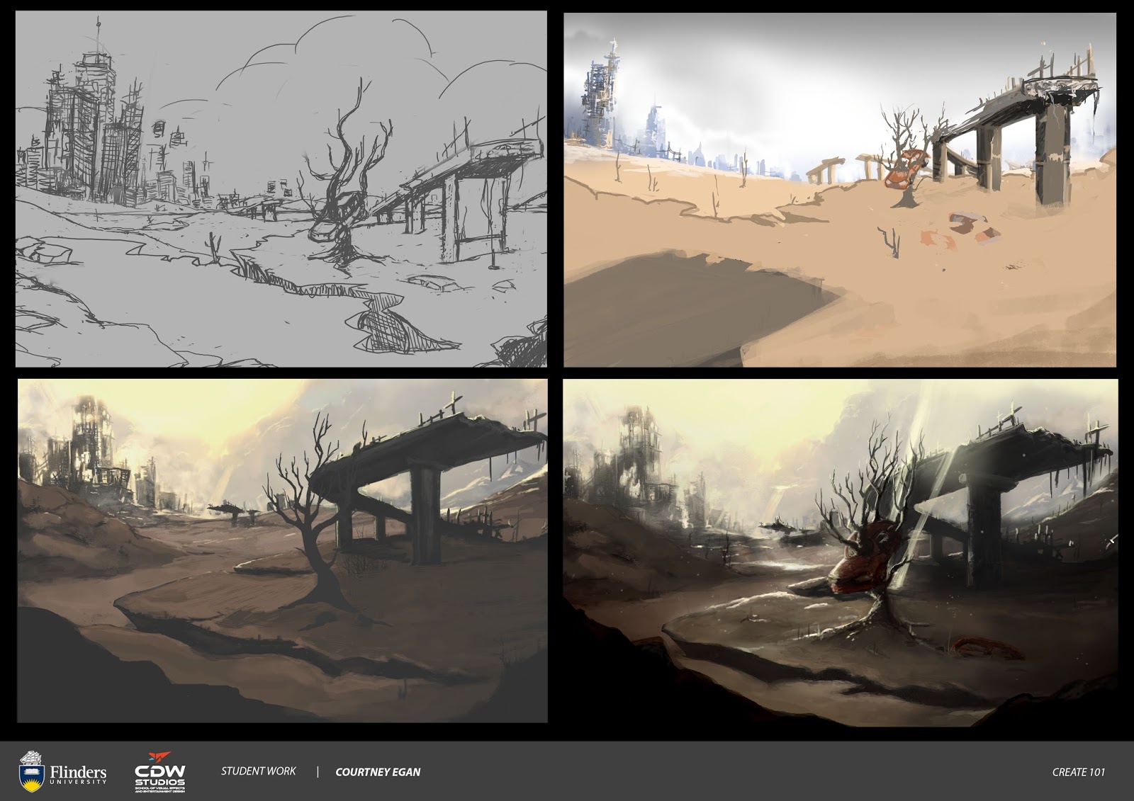
Not all is lost in this piece. I am happy that I followed through on process steps - construction lines, using my sketchbook to work out possible composition. I was able to think about values, however, there is much work needed on my perspective and formation of foreground - background, with overlaps.

I do have some overlaps. I wasn't too happy with my colour palette. The mood is okay, I do like what I have done with the skyline. I do believe I needed a bit more detail and form in the foreground as it looks a bit too flat - also the value grades are too dark.

Overall - I think I have learned a lot from attempting this piece.


Tuesday, August 1, 2017

Create 101 - Semester 2 - Week 1- Capricorn Zodiac Warrior


Back to it. Whoo! Much drawing. Such art.

Was trying to design a Capricorn Zodiac Warrior. Capricorn is represented as a goat... fish... thing.

So at first I went in trying to make a mermaid with a goat horn helm.

I was pretty happy with the rock, but then I realized she looked a bit bored? Also the rock is sort of just floating in space. Very pretty - not quite what I was going for.


Then I tried an eco-warrior angle. I thought about what she would be fighting for and I considered adding our plastic waste problem in the oceans to my theme.


I was really happy with the gesture and felt that I got some good perspective on the tail. Then you Tim! YES YOU TIM! :P Offered some awesome and interesting feedback during the art show, letting me know that the narrative wasn't as clear as I had hoped. That I also needed to consider the hair more (to make it appear more underwater). So I went and had a look at some references and reconsidered my theme. Was happy with Simon's feedback concerning my gesture and line.


My final image has a more celestial, ancient warrior approach in theme. I wrapped the tail around like you suggested - I then also considered making the tail more interesting by adding details that remind me of a fight fishes tail (like the ones at work). :P 
I lifted the hair up and back and drew some shapes and twists to make it appear like it was floating and had individual pieces to create overlaps and depth.

I added the pink and gold in the colouring so there could be some warmer colours somewhere in the palette. I hope the horns are big and bright enough on the helm. I wanted to give them a pearl like shine or quality. (Not just golden).

I feel that I am making improvements with my line work, shading and highlights.